29 September 2026 · 1 min read
Cloudy sky with a limited palette
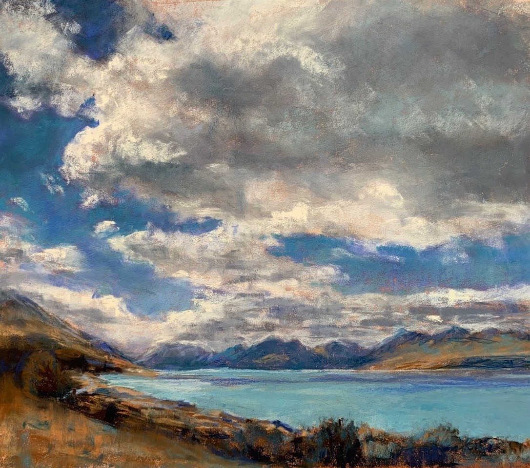
A split complementary palette of green-blue, violet blue and orange, and what changed when the value masses were underpainted in orange instead of blue.
Recently, I demonstrated for the Pastel Society of Australia at their Annual Awards and Exhibition at the Bribie Island Arts Centre. I have been preparing for a cloudy skies workshop, as well as playing with limited palettes in the weekly classes I teach.
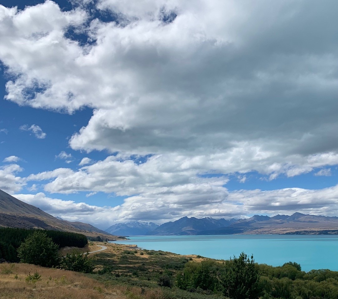
My reference was a photo of a cloudy sky on a sunny day which I had taken on holidays in New Zealand while driving to Mt. Cook. The brilliant colour of the lake water was something I had never seen before, and I was interested with how this colour was reflected in the underside of the closer cloud mass.
I chose a split complementary colour scheme of green-blue, violet blue and orange, picking out at least 5 values of just those 3 colours along with a few warm and cool greys. I chose to work on white pastelmat and underpaint the main value masses. In my initial planning and colour study I underpainted with violet blue watercolour, laying down a strong foundation of the correct values, and laying pastel over the top.
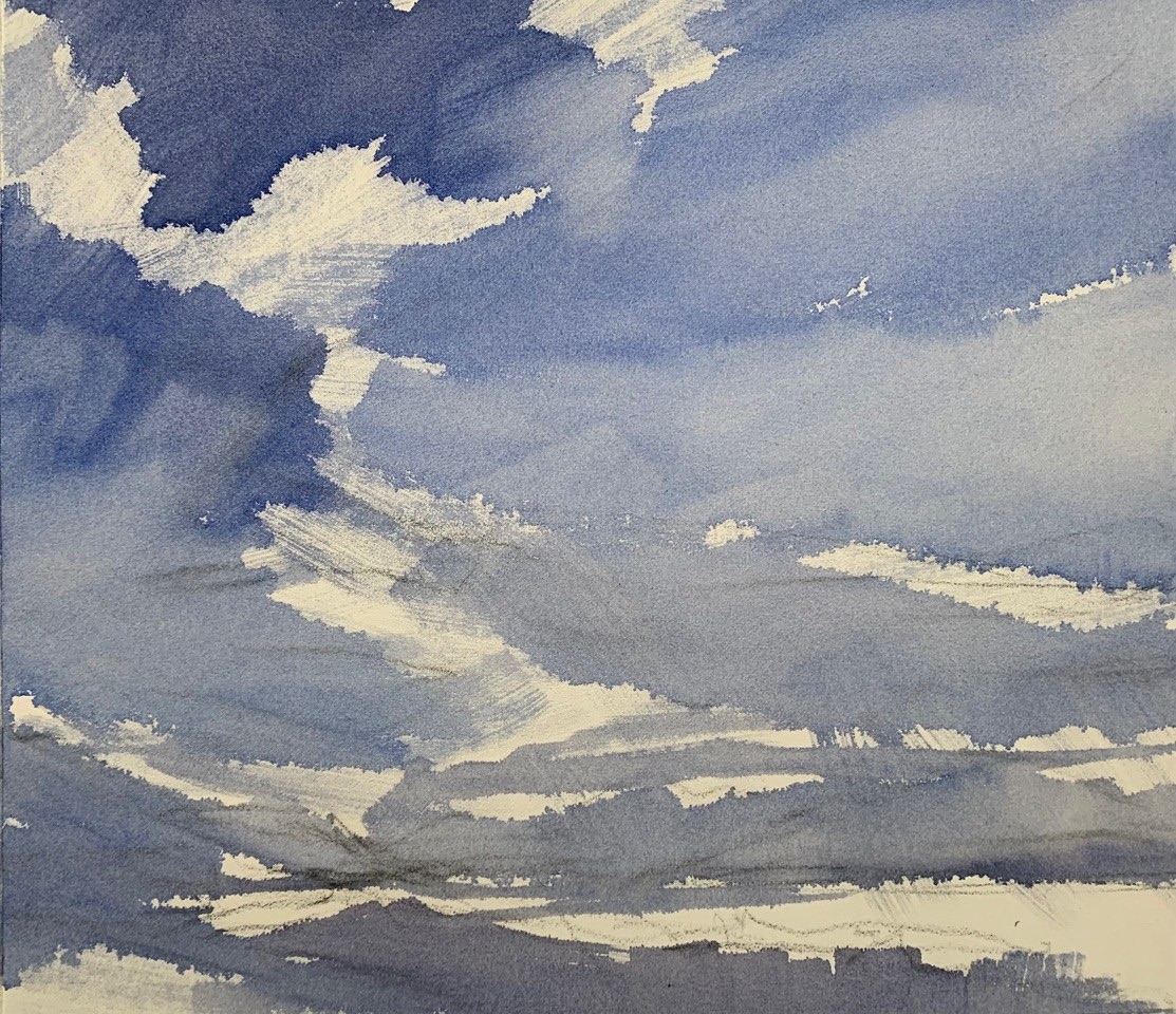
The colour study was pretty boring to be honest, being predominantly cool colours and lacking enough contrasting warmth.
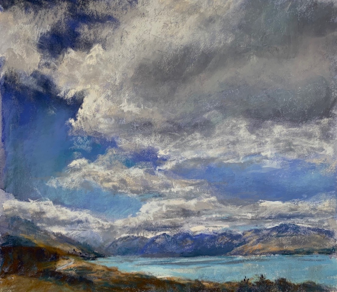
To introduce some contrast and warmth, I decided to underpaint the value masses in orange watercolour. The resulting finished painting was far more interesting, with sparkles of orange showing through, providing enough warmth to contrast with the predominantly cool palette and give a sunnier feel to the painting.